
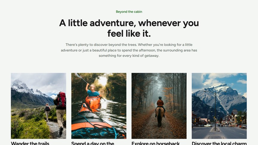
A sliding row of image cards, e.g. things to do nearby, experiences or services. The row slides when there are more cards than fit on the screen.
Content
For each card:
- Image: recommended 636 × 762 px (portrait).
- Title and Description.
- URL: optional, makes the whole card a link.
Button
An optional button under the carousel. Choose a page or paste a URL in Link: the link text becomes the button label. Style sets the look: Primary (filled, in your accent color) or Secondary (outlined). With the heading Alignment set to Left, the button is shown next to the title on desktop.
Headings & Options
The Headings & Options tab adds an optional heading above the module and sets its background. These options are the same on most modules, see Headings & Options.